Beyond the Trends: The best colour for bedrooms, according to our design experts
A thoughtfully considered bedroom palette sets the rhythm of your day and can bring quiet calm to your evening. Creating your ideal sanctuary relies on choosing tones that feel deeply personal, grounded, and enduring rather than chasing fast-moving interior trends. Our expert team has curated these bedroom colour ideas to help you pair paint shades, tactile fabrics, and handcrafted furniture into a cohesive, restorative space.
Restorative blues and rich foliage shades
Deep indigo and midnight navy remain timeless choices for a quiet luxury feel. These saturated pigments absorb natural light, gently pulling back visual boundaries to give your room a sense of expansive depth.
A bedroom with colour in dark navy creates a grounded backdrop for your space. Crisp white linen provides clean contrast against midnight walls, while velvet upholstery adds reassuring tactile richness. The Charlotte Electric Ottoman Bed in deep blue velvet pairs sleek, hidden storage with a graceful, sweeping headboard. And if you prefer slender metalwork to tailored upholstery, the classic silhouette of the George Metal Bed or Lilibet Bed in midnight blue delivers lasting architectural structure.
“Saturated shades like navy and deep green recede visually, establishing soft boundaries and depth that make a bedroom feel spacious and composed,” notes our Buyer, Rob Cole.
Botanical greens and mossy tones
Muted olive, moss, and lichen rank among the best bedroom colours for restoring quiet balance. These organic tones bring a serene connection to the outdoors into your home, effortlessly softening hard architectural lines. Green pigments contain complex undertones of yellow and blue that react dramatically to natural daylight, shifting from a fresh, uplifting tone at noon to a muted shadow as the sun sets.
Soft sage walls harmonise naturally with the sweeping curves of the Charlotte Upholstered Bed or the Orla Side Opening Ottoman Bed in rich olive velvet. And to elevate the palette, layer houseplants alongside warm candlelight. “The flickering flame catches the deep pile of green velvet at dusk, accentuating the golden undertones in the paintwork and creating an inviting evening mood,” adds Rob. “Whilst potted greenery mirrors the wall tones, flickering candlelight catches the depth of green textiles, giving the room an inviting evening ambience.”
Delicate vintage rose and warm terracotta
Exploring modern bedroom colours shows how soft pinks have evolved into sophisticated neutrals. Muted vintage rose and warm plaster introduce an inviting, radiant warmth that feels entirely timeless.
These quiet shades capture natural daylight, giving walls a soft glow throughout the day. Dusty rose creates a lovely canvas alongside weathered oak furniture, aged brass details, and washed linen. Powder-coated finishes on frames like the Lilibet Bed bring character without overwhelming the room. And warm terracotta plaster softens clean architectural lines while keeping your space bright and open.
Nuanced neutrals and natural earth tones
Creating visual depth doesn’t always require dark wall paint. Sifting through colour ideas for bedrooms shows that layered neutrals offer an equally compelling route to a serene, boutique aesthetic, particularly in rooms blessed with abundant natural light.
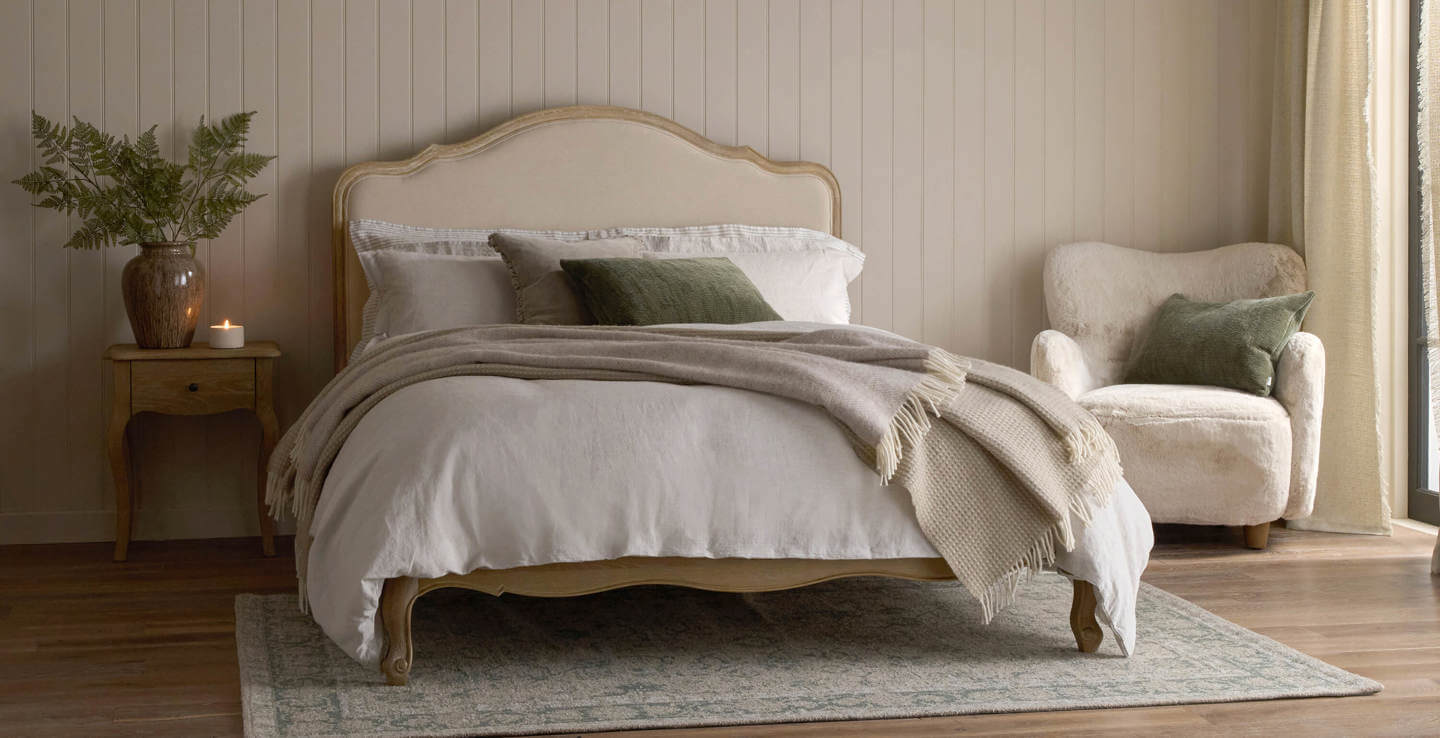
Stepping away from stark, cold whites in favour of warm alabaster, soft taupe, and stone creates a gentle radiance. These subtle shades allow natural grain finishes and textured fabrics to take centre stage.
Earthy tones offer stability and comfort. Selecting good colours for a bedroom relies heavily on how warm undertones interact with your main furniture pieces. The solid oak details and graceful lines of the Sienna Beau Linen Bed bring French-inspired refinement to a soft neutral canvas. Natural woven textiles and velvet headboards catch light delicately, adding richness without creating visual noise.
Light orientation and colour temperature
Beyond paints and fabrics, understanding colour temperature and light movement can be transformative when finding the best colour for bedrooms.
Warm undertones - such as pink, terracotta, or stone bases - counteract the cool, blue-tinted light common in north-facing bedrooms. Conversely, south-facing spaces enjoy bright, clear daylight that showcases deep navy or cool greens with remarkable clarity.
And artificial lighting plays an equally vital role in how you perceive tone. Low-Kelvin warm lighting (around 2700K) enriches muted rose, olive velvet, and natural timber, preventing dark hues from flattening after dusk. Testing paint swatches on different walls and observing them under both daylight and bedside lamp light ensures your best colour for a bedroom maintains its depth throughout the day.
Styling your palette with confidence
Determining the best colour for a bedroom comes down to the conversation between wall shades, furniture finishes, and soft textiles.
“Treat your bed as the primary focal point before choosing final paint swatches,” advises our stylist, Charlotte Bamonte-Valerio. “Upholstered headboards or slender metal frames establish a clear direction. Balance cooler wall colours with inviting, tactile fabrics like plush velvet and washed linen to soften architectural edges, keeping in mind that north-facing rooms benefit from warm undertones, while south-facing spaces showcase cooler shades with exceptional clarity.”
For more bedroom colour inspiration, our guide on considered colour schemes for a bedroom provides further ideas to help you layer your palette with complete assurance.
Bring your bedroom vision to life
Designing a bedroom palette is a deeply personal journey. At Feather & Black, we work alongside you to turn your initial ideas into a beautifully styled sanctuary built around your lifestyle.
Explore our complete collection of handcrafted luxury beds to find the perfect foundation for your chosen colour scheme, or visit your local showroom to begin styling your space with the help of our design experts.